How to Create a High-Converting Startup Landing Page
Build a landing page that clearly communicates your value proposition and converts visitors into signups or customers. Learn the structure, copy, and design principles that work for early-stage startups.
Before You Start
- 1
A clear value proposition for your product
- 2
Basic brand assets (logo, colors, fonts)
- 3
Understanding of your target customer
Step-by-Step Guide
Choose your landing page builder and set up your domain
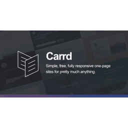
Pick a tool that matches your skill level and needs. Framer offers the most design flexibility with component-based building. Webflow gives you full CMS capabilities for content-heavy pages. Carrd is the fastest for simple single-page sites. Connect your custom domain and set up SSL. All three platforms handle hosting automatically.
If you plan to add a blog or multiple pages later, choose Webflow or Framer. If you just need to validate an idea fast, Carrd gets you live in under an hour.
Structure your page with a proven conversion framework
Follow this section order: (1) Hero with a clear headline stating the outcome you deliver, a subheadline explaining how, and a primary CTA button. (2) Social proof: logos, testimonials, or user count. (3) Problem section articulating the pain point. (4) Solution section showing how your product solves it. (5) Features with benefit-focused descriptions. (6) Pricing or CTA section. (7) FAQ addressing common objections.
Your hero headline should pass the 5-second test: can a stranger understand what you do within 5 seconds of landing on the page?
Write conversion-focused copy for each section
Lead with outcomes, not features. Instead of 'AI-powered project management,' write 'Ship projects 2x faster with half the meetings.' Use specific numbers and results wherever possible. Write your CTA button copy as a benefit ('Start saving time') rather than a generic action ('Sign up'). Address one objection per section. Keep paragraphs to 2-3 sentences maximum.
Read your copy out loud. If it sounds like marketing jargon, rewrite it as if you are explaining your product to a friend over coffee.
Design for trust and clarity
Use a clean layout with generous whitespace. Limit your color palette to 2-3 colors. Make your CTA button the most visually prominent element on the page. Add real product screenshots or a short demo video (under 60 seconds). Include trust signals: customer logos, security badges, review ratings, or press mentions. Make sure your page loads in under 3 seconds.
Show your product in action. A 30-second demo GIF in the hero section often converts better than a static screenshot or illustration.
Optimize for mobile and set up analytics
Test your page on at least 3 mobile devices. Over 50% of traffic will be mobile. Ensure tap targets are large enough, text is readable without zooming, and your CTA is visible without scrolling. Install analytics (Google Analytics or PostHog) and set up conversion tracking on your primary CTA. Add a Facebook Pixel or LinkedIn Insight Tag if you plan to run paid ads.
Set up a heatmap tool like Hotjar or PostHog to see where visitors actually click and how far they scroll. Most landing pages lose 50% of visitors before the fold.